Colorful Rotterdam hotel with fun, bold design at a really great price

Supernova / Rotterdam / Netherlands
Something that is fairly difficult to find (at least for me) are unique hotels with a powerful, interesting design that doesn’t cost a hand and a foot. In so many cases you have to pay a reasonable amount of money to stay at the really great design hotels. But sometimes I do manage to find these rare gems where you get a lot of design for your buck and it makes me so happy. Supernova Hotel in Rotterdam is one of those places.
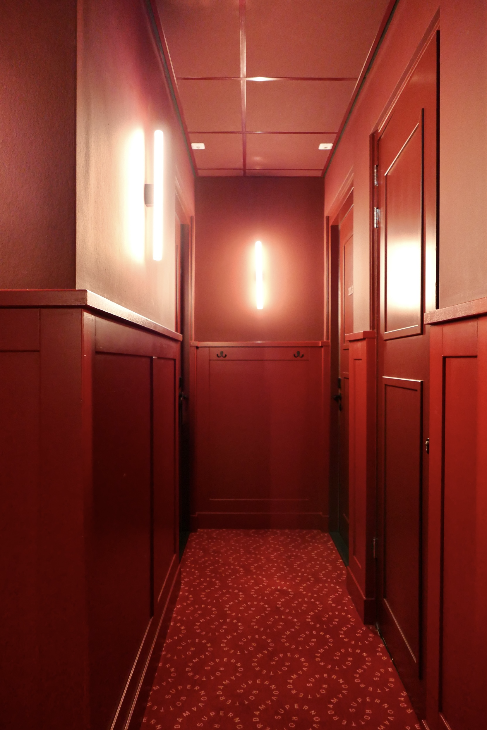
This cool, contemporary hotel with 38 rooms is situated in an old post office from 1906, located in the central parts of Rotterdam. As soon as you enter through the front doors you are drowning in color, neon signs and really great design. The use of color is really inspiring. While so many stay away from the use of bold colors Supernova does the opposite. Here more is more. The corridors are painted in this deep, rich red and combined with an equally red carpet with the hotel name printed in a curvy pattern. Our room had a blue theme where both walls and most of the furniture had the same kind of deep blue.
The whole idea with Supernova is to blur the line between hotel and home. They have actually gone as far as to call it a non-hotel. The rooms are all individually designed so you’ll never know exactly what to expect. Ours had a large lounge area, a turn table, a huge porcelain cat and the most comfy bed ever. I really want to applaud this. I am such a fan of hoteliers that dare to take a design all the way and who also makes it accessible to many by keeping the price at a reasonable level.

Supernova Hotel is situated in an old post office in Rotterdam. The neon sign makes it really easy to find.

The hotel is all about rich, powerful colors. This part of the lobby is the first thing that greats you when you arrive.

This light installation in the atrium of the hotel is so cool.

Flowers and neon. A winning combo.
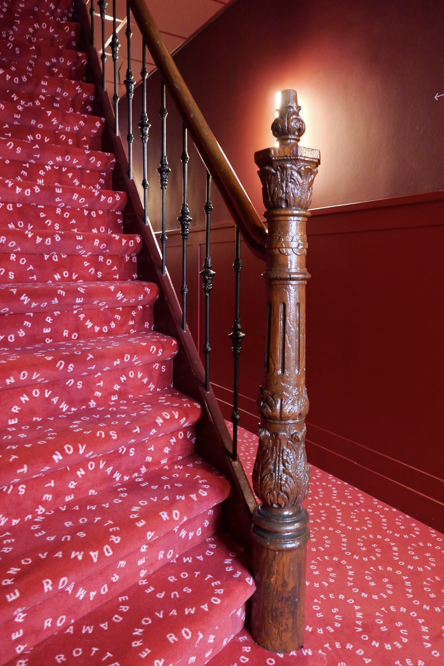
The corridors are all red. Red walls and red fitted carpets with the hotel’s signature print. It all clashes in all the right ways with the old wooden staircase.
I love everything about this! It feels like something from a movie. Like something bad is about to happen in one of the rooms.

The bold use of color continued in our room. This pale blush is everything. Especially when it is paired with this mock terrazzo pattern and classic tiles.

Our room was all in blue. Blue walls and blue furniture.

Hello bed! I am ready for you!

If I wasn’t convinced before I sure was when finding this little baby in a corner of our room. I don’t think I’ve ever stayed in a hotel with my own massive porcelain cat (not sure what kind it is…)
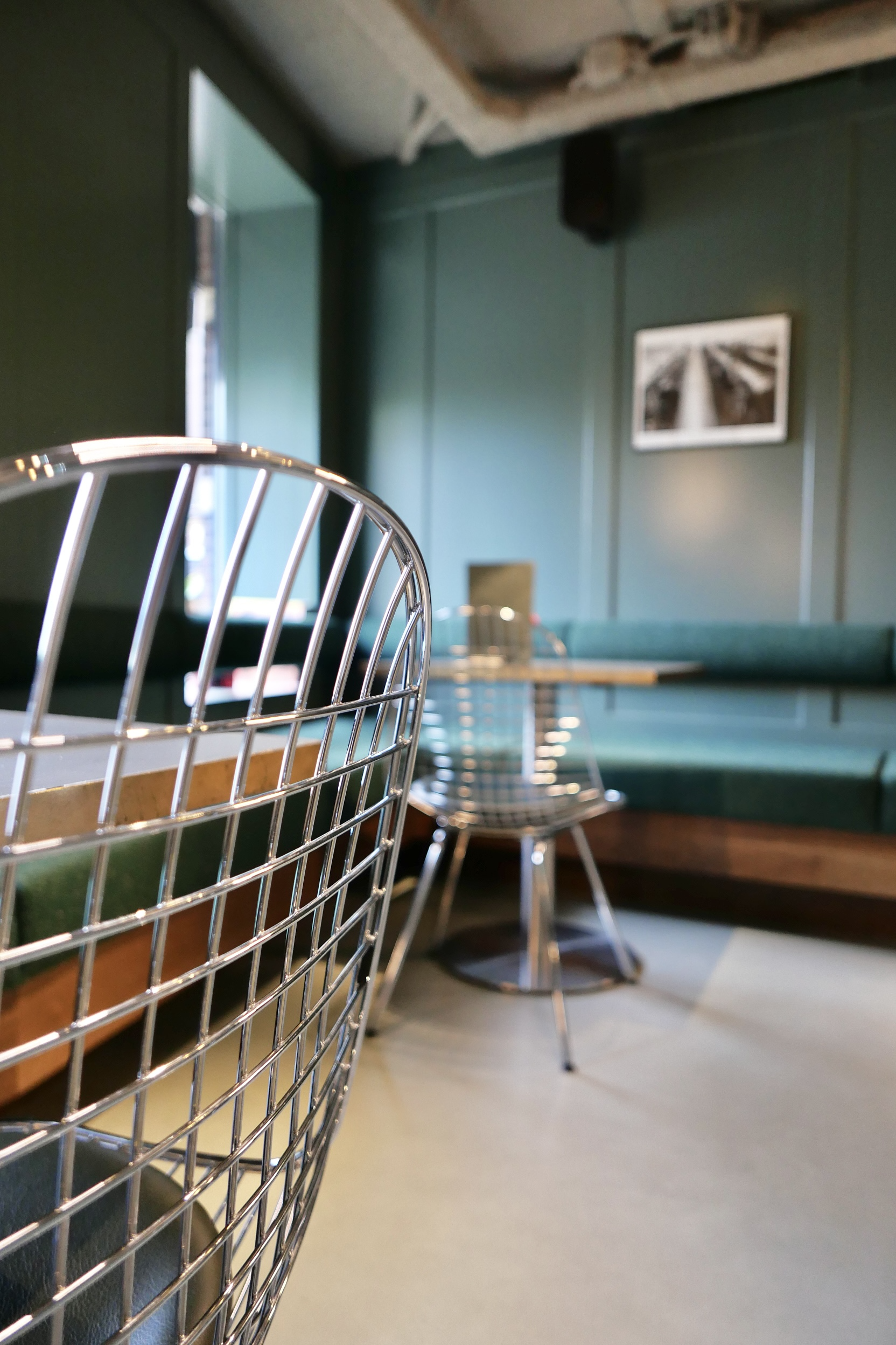
The lobby/restaurant was very discreetly design with contemporary metal chairs. Worked really well against the classic wooden panelling.

If you’ve read this blog before you know how important coffee is to me. And here they serve really great coffee from local roasters Giraffe.

This is how a hotel shop should look. A loot of fun little things, local products and things you can eat which is usually not the case with hotel shops.
RG inside info
Date of RG stay:
August 2021
This place is perfect if you…
…are done with Amsterdam and want to explore the Dutch second city. And while doing so you want to stay at a warm, bold design hotel that reflects the edgy, creative nerve of the city, this is your place.
My favorite thing about this place…
…is the use of color. In many cases we refrain from using powerful colors and going for safe bets like whites, greys or maybe some soft pastels (and don’t get me wrong, that can be really stunning too), but there is something about these primary colors.
What not to miss when staying here is…
…to explore this creative city. There are many great areas. One I like a lot is Witte de With Street where you’ll find a lot of quirky shops, bars and restaurants. The best burger in town is to be found here, at Ter Marsch & CO. It is supreme!
If you like this hotel you might also like…
Pilar / Antwerp, Belgium
Daen’s / Utrecht, Netherlands
Autor Rooms / Warsaw, Poland
